

Radical AI: Kai

Project:
Radical AI: Kai
An Assistive Teaching Tool for Educators
My Role
UX designer
•
Squad Lead
•
Researcher
•
UX designer • Squad Lead • Researcher •
Project Overview:
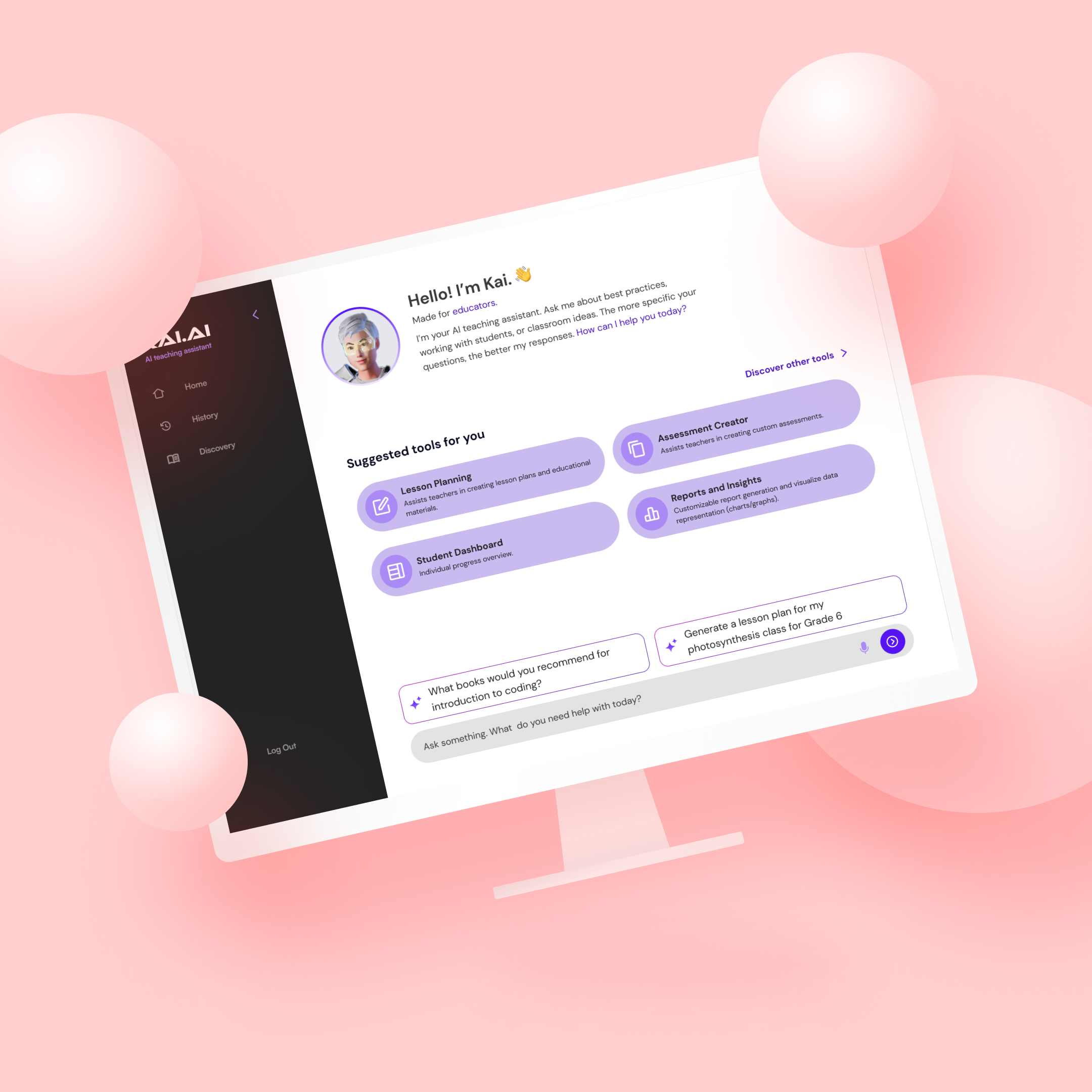
Kai is an AI-powered Teaching Assistant designed to interactively support and enhance the learning experience of students. The application's V1 UX design is in place, and we now require a visually compelling and intuitive UI design to complement and elevate the existing user experience framework.
The Problem:
Educators spend more than 25 percent of their day addressing issues like software glitches, creating worksheets for students, testing out organizational tools, finding activities for students, and many more. Kai is an assistive tool for educators that is designed to allow teachers to reduce unneeded time waste and maximize efficiency through generative AI tools.
Goals
-
Create a visually attractive interface that captures and retains user attention.
-
Ensure the UI is intuitive, reducing learning curves and enhancing user interaction.
-
Maintain a consistent look and feel across all screens and devices.
-
Design an interface that is accessible to a diverse user base, including those with disabilities.
Design Process:
I was working on another feature for Radical AI when I came onto this project. The project went through sketches, some research, and the middle stages of low fidelity mockups. Me and a few other designers were dropped into squads and we were told to start iterating on designs. So I started looking over previous work.
It dawned on me that I could provide a lot of information for what we were designing. I was a teacher for a very short while but I understood what teachers' pain points were and what teachers' needs were so we started iterating on more designs and started interviewing more teachers.

A few members of another squad and myself started putting together a list of potential interviewees and started interviewing users to focus more on what users really wanted or used in their day-to-day life.
So, we had initial designs and partial research. Our problem was, how could we create a homepage for Kai that could provide teachers with all the tools they need to maximize their time and work more efficiently.
We ran into a few issues over the next few weeks, one of which was overlapping design and features of the Discover section of Kai. We collaborated with Discover Squad and started reiterating on the home page.
We created different iterations of our home page and after a few weeks of designing, we landed on a stripped down version of our initial design.


Results:
With collaboration with the Discovery Team, we decluttered and optimized visibility of the Home Page by more than 75 percent. Our final design helped eliminate time spent browsing on the Home Page, which was presented in our initial evaluation of software used by educators.